

Example: planning a mobile ecommerce redesign
Retail
An illustrative store redesign brief covering product discovery, mobile product pages and checkout. This is an example approach, not a delivered client project.
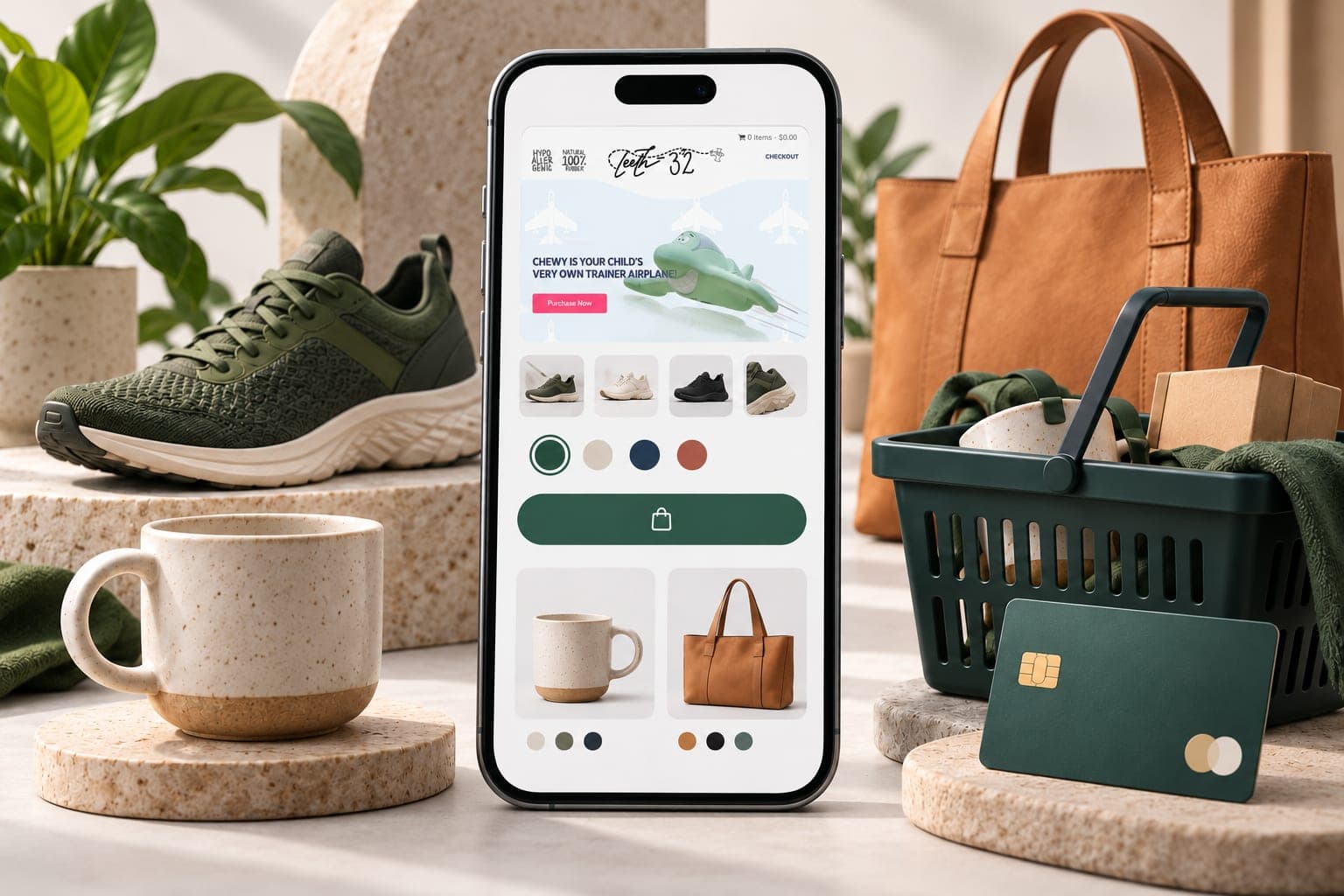
Illustration with a website preview from Teeth 32.
The example brief
Imagine a retailer whose catalogue is difficult to browse on a phone. Buyers need to compare product variants, check delivery and reach payment without losing their basket. The first task is to establish where the current experience fails, using permitted analytics, support questions and a short review with representative shoppers.
This scenario explains how that review could become a build scope. It does not describe an identified retailer or claim a measured conversion problem.
A possible approach
Begin with the catalogue: product types, variant rules, search terms and the filters customers need. Sketch a category page and product page using representative products, then review the route through basket, delivery and payment.
A prototype can test whether buyers find price, stock and shipping information. Development would also cover the agreed payment methods, validation, order emails and recovery from a failed payment. Existing stores need a data inventory, URL mapping, test orders and a rollback plan.
Record the initial evidence and release date. A later improvement claim would need comparable traffic, accurate transaction tracking and enough orders to support the conclusion.
Illustrative planning example. This page does not describe a delivered client project or publish measured client results. Small website previews within this illustration use our published Teeth 32 project as visual references. They do not document delivery of this scenario.
Services relevant to this example 3
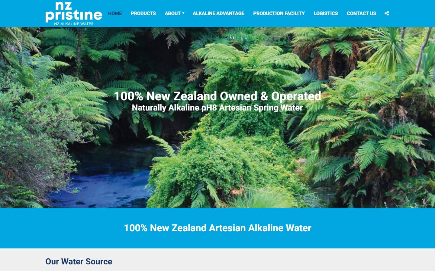
NZ Pristine
A WordPress site for a New Zealand artesian alkaline water brand, structured so a buyer can trace the product from spring to production facility to logistics before ever reaching a contact form.
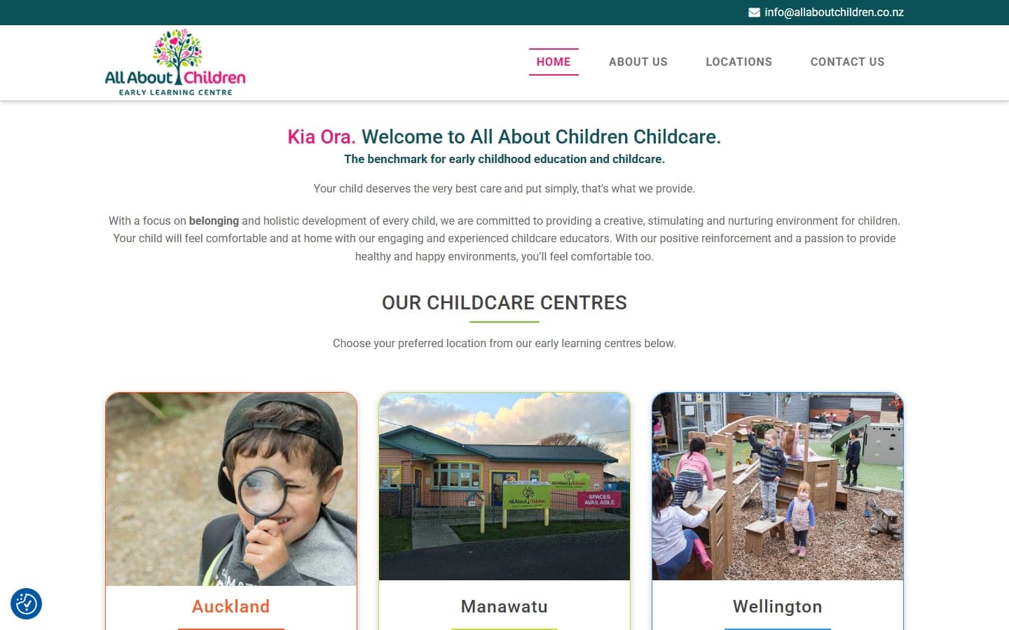
All About Children Childcare
A WordPress site for a childcare group running centres in Auckland, Manawatu and Wellington, built so a parent in any of the three regions lands on the right centre in one click.
Have a project in mind?
Tell us what you want to build or improve. We can walk you through relevant work and discuss the scope, budget and next steps.